File upload
A file upload allows users to transfer one or multiple files from an external source to the web application. This pattern is commonly embedded in forms or as a standalone element.
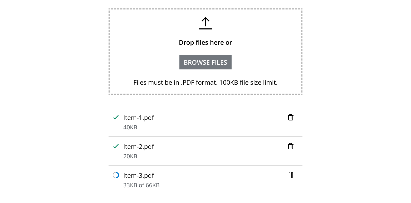
Use this pattern to:
- Upload files by dragging and dropping, or by using a button to select a file in a new window or file browser.
- Upload single or multiple files within modals or full-page experiences.
- Display file upload progress, file listings, and management options.
- Consider using a full-page layout or a drawer if additional actions need to be performed on the files.
- When used in dialogs, ensure that submit actions are disabled until the file upload is complete.
- When used in drawers, the upload status (e.g., completed) should remain visible regardless of the drawer's open or close actions.
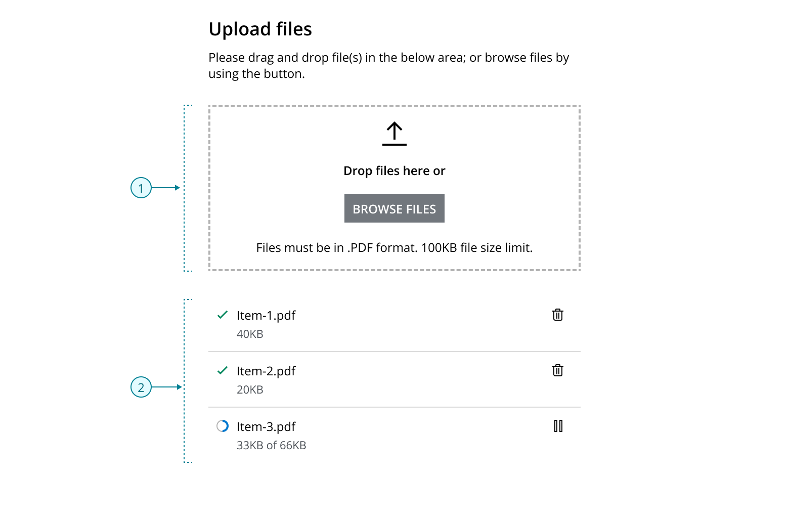
A file upload pattern typically consists of two main functional areas:
- Upload area: This provides a target area for users to drag and drop files. It is implemented using the
FileDropZonecomponent. - File upload list: This area can display a single item or multiple items stacked vertically. Items in this list are constructed using the
StaticListcomponent.
These functional areas can be enhanced with text elements, such as headers and descriptions, to assist users in making informed decisions.
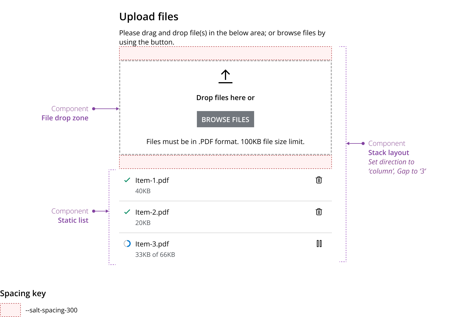
- Use the
StackLayoutto display the File drop zone, file upload items and text elements that make up file upload in a column. - Use the
StackLayoutwith a gap of 1 to position the text elements.
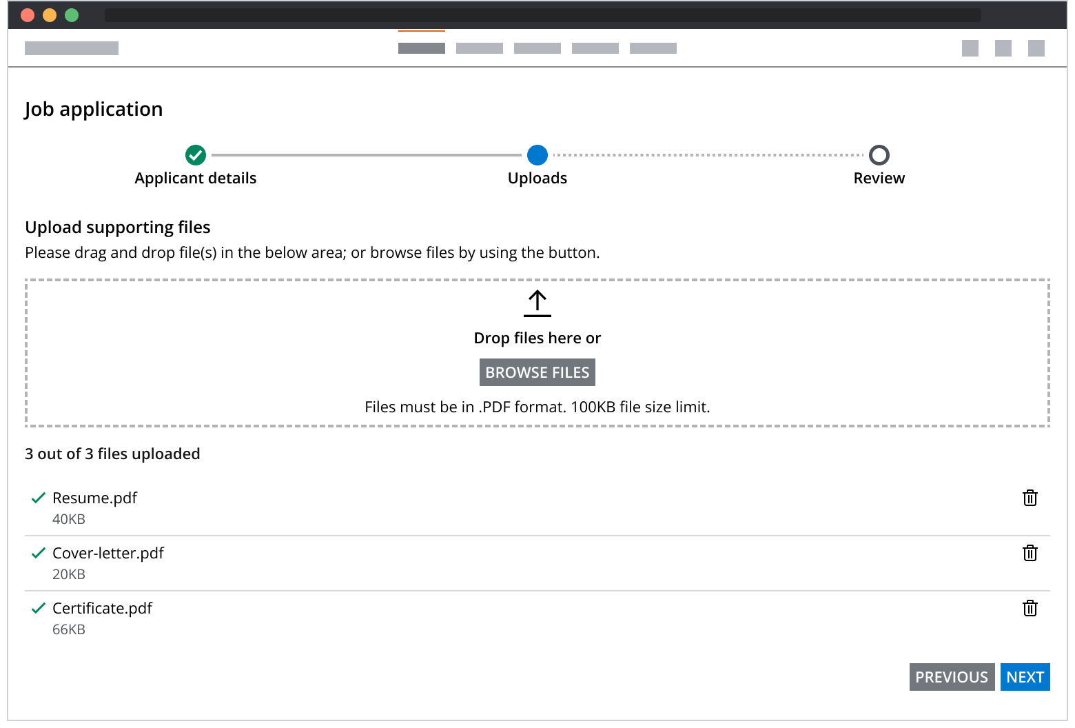
The file drop zone component enables users to upload files by providing a designated drag-and-drop target area. It supports both single and multiple file uploads in unrestricted space areas.
- The file drop zone component should support both single and multiple file uploads.
- Restrict file selection to allowed file types.
- Include text elements to assist users in making informed decisions.
In space-restricted scenarios, single file uploads can be facilitated using a button. This button opens a file browser, allowing the user to select a file.
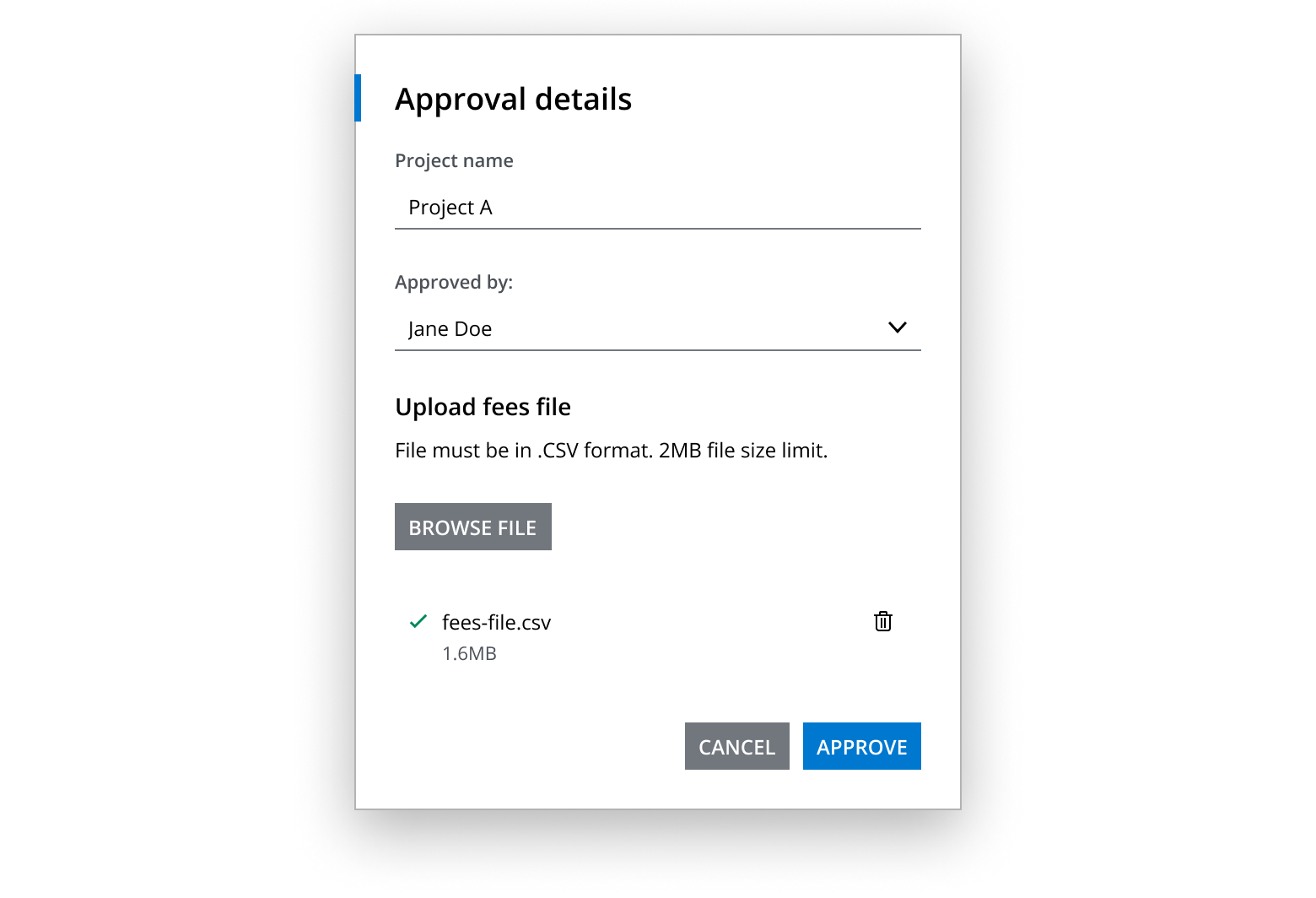
- Use a button for single file uploads only
- Restrict file selection to allowed file types
- Include text elements to help users make informed decisions
Ensure users are aware of the upload progress for each file. Use the progress component and a secondary label to display relevant information, helping users manage their expectations. Use action buttons to assist users in managing files. For example, a pause button can be used to put a file upload on hold.

Following a pause action, play and delete buttons can be used to resume or remove the upload, respectively, as shown in the example below.

Inform users when a file upload has been successfully completed. Once the process is finished, provide users with the ability to remove the file or perform other related actions.

Error validation can occur independently at the file item level without impacting other files in the group. In such case scenarios, the secondary label should clearly explain the issue and offer a solution. A refresh button can be used to retry the upload after error validation.
Inform users when a file upload has been successfully completed. Once the process is finished, provide users with the ability to remove the file or perform other related actions.

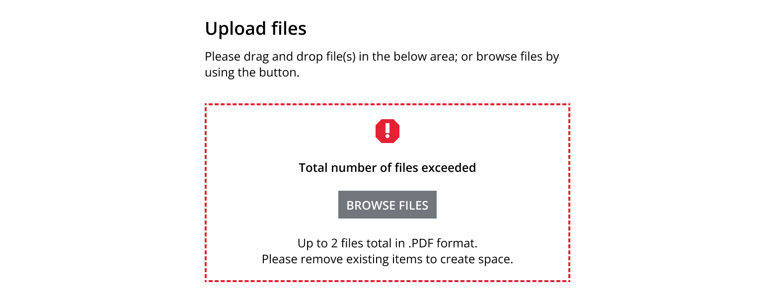
Errors can occur at the group level. In such scenarios, error messages should be displayed within the file drop zone component. For instance, if only 2 files can be uploaded, the error message should clearly communicate this limit and guide the user, as demonstrated below. For more details, see file drop zone validation.
Alternatively, group error messages can be displayed using a banner component positioned below the file drop zone. In such scenarios, ensure that error messages are displayed exclusively in the banner and not within the file drop zone itself.
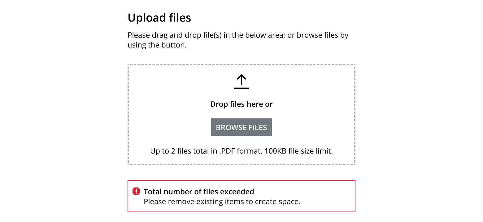
- Clearly communicate the issue and offer a solution
- Ensure error messages are simple and concise
If you need to expand the pattern or share feedback with us, please contact the team.